


çanoma
çanoma is a fragrance brand born in Paris. Under the direction of Yuta Watanabe, a Japanese creator, and with the proven skills of Jean-Michel Duriez, a French perfumer, çanoma brings new ideas to life in a finely tuned fragrance. We Ginger provides consistent support for all branding aspects, including logo design, package design, and website creation.
çanoma(サノマ)は“上質な日常”をテーマにパリで誕生したフレグランスブランドです。日本人クリエイター、渡辺裕太のディレクションと、フランス人調香師のJean-Michel Duriez(ジャン=ミッシェル・デュリエ)の確かな技術によって、新しいアイディアを繊細に調整された香りに仕上げています。Gingerはロゴデザインやパッケージデザイン、Webサイト作成などブランディングに関わる部分を一貫してサポートしています。
Official site
About çanoma
From a global perspective, it is said that there is not much custom of using perfume in Japan. One reason for this is that many perfume brands are directed by foreign creators, and there are few fragrances that match Japanese sensibilities. On the other hand, France has a long tradition and excellent skills in perfumery. çanoma is directed by Mr. Watanabe, a Japanese creator, and perfumed by Jean-Michel Duriez, who has worked on perfumes for Dolce&Gabbana, Yohji Yamamoto, Lacoste, and others.
世界的に見ると日本には香水を使う習慣があまりないと言われています。その一つの要因として、多くの香水ブランドが外国人クリエイターのディレクションで作られており、日本人の感性にあった香りが少ないことが挙げられます。一方で、香水を調合する”調香”に関してはフランスには積み重ねられた伝統と素晴らしい技術があります。çanomaは日本人クリエイターの渡辺氏が、日本人の感性でディレクションし、調香はDolce& Gabbana, Yohji Yamamoto, Lacosteなどの香水を手掛けてきたJean-Michel Duriezが行っています。
Brand identity
Logotype + brand color

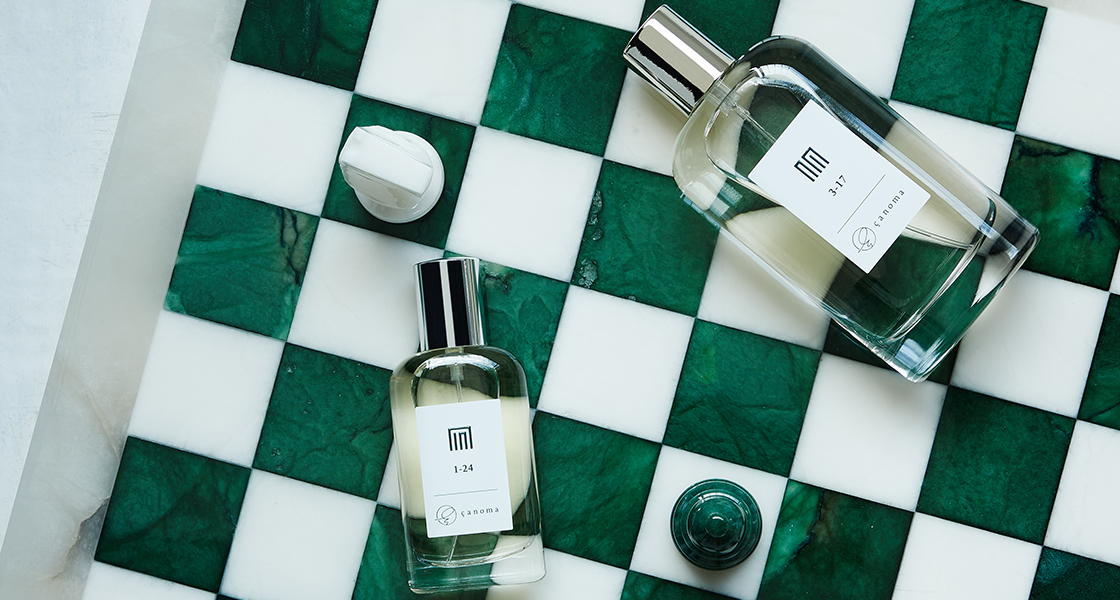
The name çanoma comes from “Sado,” the traditional tea ceremony and “Chanoma,” the dining room in Japanese house representing a combination of elegance and everyday life. In order to incorporate this concept into design, we decided to use shapes and colors which superficially looks extremely simple but at the same time, gives the impression of extraordinary care through the slightest detail. The logotype is consisted with basic shapes of the alphabet, but features gently flowing curves to express the tenderness of loving the little things. The brand color is an extremely deep green, a trick that it looks black at first glance, but upon closer inspection, you’ll realize that it is slightly green.
çanoma(サノマ)という名前は茶道+茶の間から来ており、上質と日常の組み合わせを表しています。そのコンセプトを具体的な色・形に落とし込むために表面的には極めてシンプルに見えつつも、僅かなディテールによってただならぬこだわりを感じさせる、そんな方向性を目指すことにしました。ロゴタイプはアルファベットの基本的な形状でありながら、ゆるやかに流れるような曲線を特徴とし、些細なことを愛おしむ優しさを表現しました。ブランドカラーには極めて深い緑を採用し、一見すると黒に見えるが、よく見るとわずかに緑であることに気づく仕掛けになっています。
Symbol mark

çanoma is a brand that combines Japanese sensibility with French esprit. To express this, we designed a logo that combines the “ç” of çanoma with the hiragana character “さ.”
çanomaは日本人の感性と、フランスのエスプリを組み合わせたブランドです。それを表現するものとしてçanomaの”ç”とひらがなの「さ」を組み合わせたロゴをデザインしました。
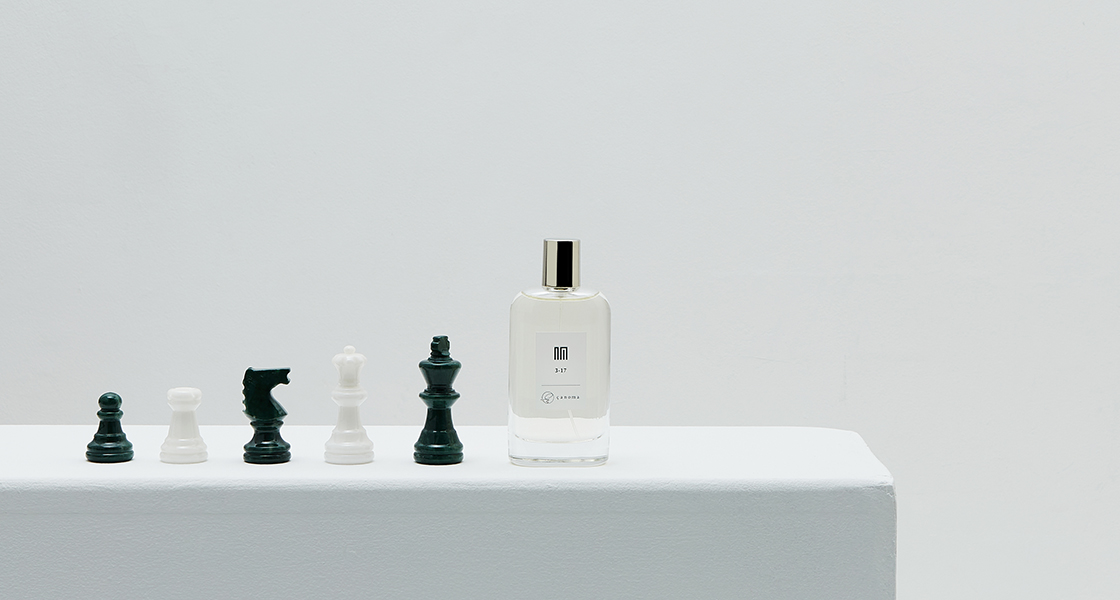
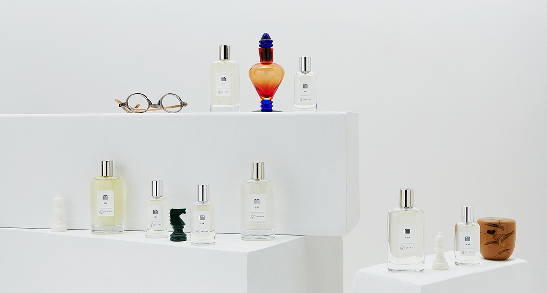
The bottles and packaging are decorated with “ko no zu,” and each perfume is subtitled with the name of its ko no zu, such as “Suzumushi,” “Sawarabi,” and so on.
また、ボトルやパッケージには「香の図」を採用し、それぞれの香水にはサブタイトルとして「鈴虫」「早蕨」など、香の図の名前がつけられています。
In Kodo, the traditional Japanese culture of fragrance, there is a game of guessing the combination of fragrances, and the symbols used for this game are the “ko no zu”. The names of the characters in the Tale of Genji (Genji Monogatari) are associated with each of the 52 diagrams.
日本の伝統的な香りの文化である香道には香りの組み合わせを当てる遊びがあり、その際に使われる記号が香の図です。また、全部で52通りある香の図には源氏物語の登場人物の名前が対応付けられています。
Media & Awards
NOSE SHOP Award(Newcomer)
Fashionsnap.com
Ku:nel
COLORIA MAGAZINE
VISION OF FASHION